Here's something that 90% of people aren't doing on LinkedIn which generates amazing results for the 10% who are: Leverage a custom LinkedIn cover photo.
Data shows that humans only remember 20% of what they read, but they remember 80% of what they see. On top of that, our brains process visuals up to 60,000x faster than text!
That's why people with custom cover photos get more connection requests, more messages, and more job interviews.
But here's the kicker… almost nobody is taking advantage of this!
When I was writing this post, I clicked through over 500 LinkedIn profiles — over 90% of them were using the default LinkedIn Cover photo.
That's a huge missed opportunity to stand out from the competition. The good news is, now you know!
In this post, I'm going to show you how to create a LinkedIn cover photo that gets results in under 5 minutes.
We're going to walk through the basics:
- Dimensions of a LinkedIn cover photo
- LinkedIn cover photo ideas and templates
- How to create a LinkedIn cover photo (in 5 minutes)
- LinkedIn cover photo examples for inspiration
- How to update your LinkedIn cover photo
I'll be sharing a bunch of awesome cover photo ideas and templates that you can use to get better results from your profile.
I even have a quick video walking you through the exact steps I took to create my own LinkedIn cover photo (using tools that are 100% free)!
Let's dive in:
LinkedIn Cover Photo Size & Dimensions
When you're creating and uploading your cover photo, you need to make sure it matches LinkedIn's sizing guidelines so it doesn't get rejected (and ends up looking great).
According to the LinkedIn's official image specifications, here are the most recent guidelines for your cover photo size and dimensions:
- 1,584 x 396 pixels is the recommended cover photo size
- Cover photos can be larger or smaller but should always maintain a 129:8 aspect ratio
- Cover photos have a maximum file size of 4mb
- LinkedIn accepts PNG, JPG, and GIF file types for cover photos
Once you check all the guideline boxes, there's another major factor that you need to consider — your profile's layout on different devices.
Your LinkedIn profile will look different depending on what device someone is using to look at it.
On a desktop, your cover photo will spread nicely across the page but it will shrink as the screen size gets smaller. On devices like smartphones, your profile picture will also change position.
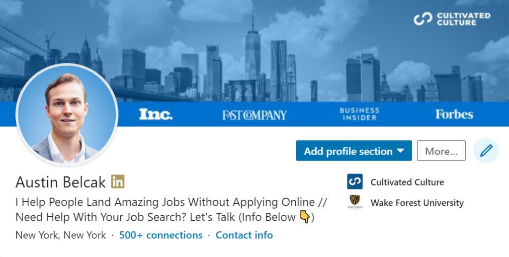
Check it out. Here's an example of my cover photo on desktop:
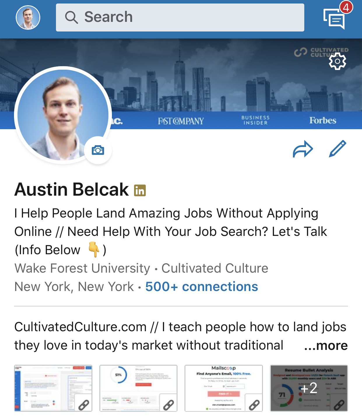
And here's what my cover photo looks like when someone's viewing my profile on their smartphone:
See how my profile picture stays on the left side of the screen on both desktop and mobile? But notice how it covers up more of the banner image on a mobile device.
You'll need to keep that in mind when you're designing your cover photo – you don't want important info to get missed just because someone is viewing from a different device!
Finally, there's one more guideline you need to keep in mind — quality.
Whether you realize it or not, people will make judgments about you and your capabilities based on the images you use. When you're choosing a cover photo, you want it to be high quality with the best resolution possible.
LinkedIn Cover Photo Ideas & Templates
With all the possibilities out there, figuring out what type of image to use can be overwhelming.
Here are some LinkedIn cover photo ideas and templates to help make the decision easy!
Banner Image Idea #1: Hobbies & Extracurriculars
Ideally, your cover photo is injecting some personality into your profile. Something that helps flesh out your story and speak to who you are as a person.
Recruiters and potential clients love to see that there's a real human on the other side of the pixels on their screen! Here are a few ideas to get the wheels turning:
- Do you volunteer outside of work? Share a picture of yourself in action!
- Do you speak at company/industry events? Show yourself up on stage!
- Are you a marathon runner? Let's see a shot of you with that bib!
- Like to go hiking? Everyone loves the mountaintop victory snap.
- Just got back from a life changing trip? Share your favorite picture!
Here's a LinkedIn banner example of volunteer work:
And this example could be used to showcase a hobby or recent trip:
The possibilities are really endless here, just make sure to use common sense and pick something that's professionally appropriate.
Banner Image Idea #2: Images That Represent YOU!
So maybe you don't have a super cool image of you speaking in front of a crowd or bringing clean water to a village in Haiti. That's totally fine!
You can convey just as much personality without actually being in the photo, just choose something that's meaningful to you. Here are some ideas:
- Love your city? Rep it in your cover photo, show a unique angle for some extra personality.
- Love another city? Maybe one you've traveled to? Share your favorite memory!
- Have a preference for pour over coffee vs. drip? Show us how it's done.
- Have a photo that just speaks to you? Put it up there.
This selection is totally personal, so it's hard to create a formula for it. Although it may take some searching, an image that speaks to who you are is so much better than the boring default that everyone else has.
If this idea is for you, I'd highly recommend checking out Unsplash or Pixabay. They both have tons of super high quality, royalty free pictures that you can use for your banner image.
Here are some examples I grabbed from a few minutes of searching on Unsplash – they all match LinkedIn's guidelines, so feel free to download them. If you're on mobile, you can access the entire Unsplash image library using a free app called Instasize.
I'll show you how to edit them in just a minute:
I personally like bright, multicolored images. This one gives off serious creative vibes and is guaranteed to grab attention. I might throw some text on top of it but it's a great option!
I live in New York City and I absolutely love it. I don't love the same generic pictures of the city from the Rock Center roof though.
I love this shot because the white background makes the buildings (especially the Freedom Tower) pop and the skyline is on the right side of the image so my profile picture won't obscure too much of it on any device.
This might be the perfect LinkedIn background image! The whole point of LinkedIn is making new connections and coffee is a great way to take things offline.
This image shows you're open to meeting new people and your potential love for coffee.
Again, I grabbed each of those with a few minutes of searching on Unsplash and I would feel great about using any one for my LinkedIn cover photo.
Banner Image Idea #3: Professional Achievements
If you’d prefer to keep a more professional tone for your LinkedIn profile, no problem! That’s also an option. And there are still ways that you can showcase a bit of your personality.
One great way is to share some highlights from your career. Here are some ideas:
- Did you recently lead a team workshop? Show a photo of you in action.
- Have you given a speech at a company conference? Share a picture of you at the podium.
- Were you interviewed for one of your company’s promotional videos? Let us see you sitting in front of the camera.
- Do you have an impressively organized set up at your work desk?
Inspire everyone with a simple photo. There are tons of possibilities with this one too. Just be sure the cover photo is about you and not an advertisement for your employer.
Banner Image Idea #4: Combine & Customize
If you want to take your cover photo to the next level, you can leverage a photo editor like Canva or Pixlr to combine photos, add text, and layer on filters.
This is an awesome way to show off personal branding, promote something, or add social proof.
For example, here's my cover photo. I made it in Canva, (more on that in a second), and it combines my home city of New York with my brand colors, my logo, and the publications I've been featured in:
One of my favorite people on LinkedIn, Fabio Marrama, has some awesome head shots, pictures of himself speaking, his content being featured, and his personal hashtag:
Another buddy of mine, Tim Salau, has a head shot, his personal brand “Mr. Future of Work,” a call-out about what he loves doing (speaking & community building), and social proof with logos from some of the best companies in the world:
You can easily make all of these examples in one of the editors I mentioned above, no professional experience (or money) necessary!
At this point, we've covered a few cover photo ideas, but sometimes it's hard to visualize yours from scratch. In the next section, I'll show you where you can get some cover photo templates to help spark some inspiration.
LinkedIn Cover Photo Templates
For those of us that weren't born with the design gene or aren't feeling super confident about this whole cover photo thing, there's good news!
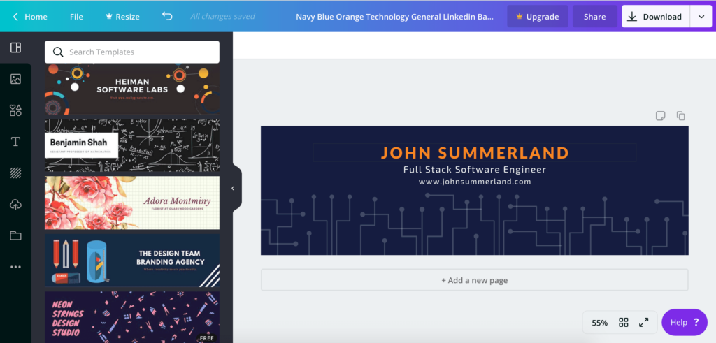
Canva, a graphic design software company, went ahead and put together 1,200+ LinkedIn cover photo templates that anyone can edit and download for free:
You can comb through Canva's LinkedIn cover photo templates and pick one that you like.
After you select it, Canva will take you to their editing software where you can easily edit the entire thing. Change the text, add your email, drop in a picture of yourself, find free icons — the works!
When you're done editing, you can export in PNG or JPG (both LinkedIn-friendly file types) and then upload it straight to LinkedIn.
If the image you export ends up being too big, go to CompressPNG or CompressJPEG to make the file size smaller.
Boom! Now you've got your very own cover photo that looks like it was designed by a professional (but we'll keep the secret between us, yeah?).
How To Make An Amazing Cover Photo In 5 Minutes (Or Less)
At this point, you should have a good feel for what types of banner images you can use to make your profile stand out.
But, as I said before, I know how hard it can be to go from idea to reality so I'll breakdown the exact process. I went ahead and recorded a video on building a LinkedIn cover photo from scratch in less than 5 minutes (make sure to hit the full-screen button!):
And here's the final product! Check it out:
More Awesome Banner Image Examples
To close things out, I wanted to share a few more examples of great LinkedIn cover photos along with a few details about why I think they're awesome:
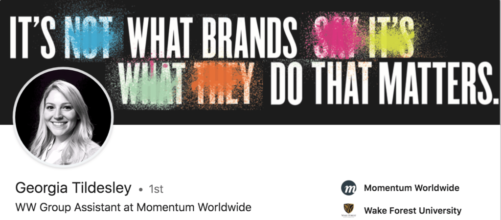
Not only is her cover photo awesome, Georgia's whole profile aesthetic is on point. I love how the black background of her profile picture matches the background of her cover photo.
Dialing into the cover photo, I love this design. She uses bold font on a black background to make a statement and the pops of color really grab your attention. Finally, she does a great job of sharing her personal mantra when it comes to branding and business.
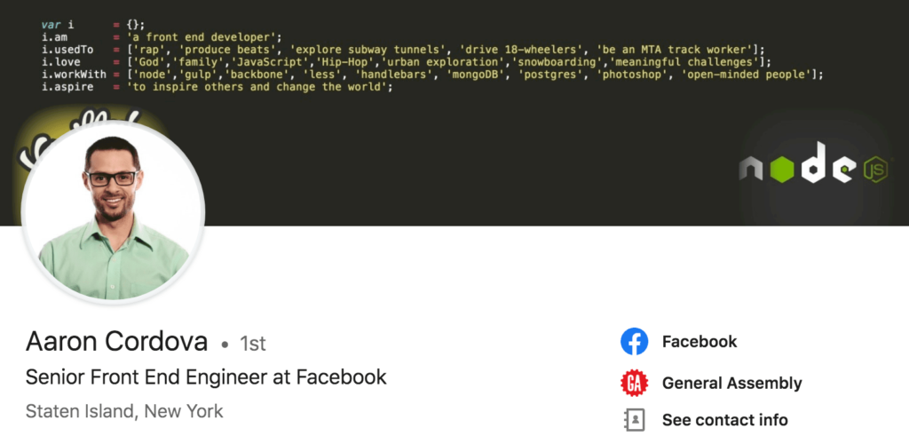
Aaron's cover photo is incredibly creative and relevant to his field. He leverages code to tell us who he is, what he's done, and what he's passionate about.
As a front end engineer, this couldn't be more perfect. Code is a fantastic medium to use to inject some personality and I love that Aaron gives us a window into his previous life as a rapper, truck driver, and MTA worker before landing at Facebook.
That is prime conversation-starter material right there!
Here are some more great LinkedIn banner image examples:
How to Update Your LinkedIn Cover Photo
Now you have some ideas of what types of images you can use for your cover photo. But how do you update it on LinkedIn? Let me show you!
First, you need to go to your LinkedIn profile. Then you’re going to click on the little pencil icon in the top right corner of the cover photo.
Once you have that open, you’re going to click “Change Photo” in the bottom right corner.
Next, you’ll select “Upload Photo” and choose the cover photo you either downloaded from a site like Canva or another one that's custom made.
After that, just adjust to make sure the photo fits well in the space and press “Save”! Pretty easy, right?
Up Next: How To Optimize Your LinkedIn Profile
Awesome! Now that you know how to create an amazing LinkedIn banner image, go check out my guide on how to fully optimize the rest of your LinkedIn profile.
It's an 8,000+ word guide that covers every single aspect of your profile in detail so you can get more views, land more job interviews, and generate more leads!
If you have any questions about cover photos or want to add your own tip, feel free to drop a comment below!

















Great article to me and I updated my cover photo!
Thank you very much, Austin.
Right on Wanhao! Love that you took action on the advice, keep it up!
Hello! I have always wondered where in Settings to go. It’s easy to find how to update your profile picture, but not the cover. I’m guessing that’s the reason why many covers remain the same.
Thank you,
You may be on to something Angelica! Glad this post made it easy to find where to change it 🙂
The best article on this topic I have read which offers true inspiration and ideas rather than generic content repurposed from somewhere else! Thanks.
You made my day Noreen! Thanks so much for the kind words, I tried to cover as much as I possibly could in here. I’m glad it was helpful 🙂
Thank you so much Austin! You are a star for making this is simple and easy like 1, 2, 3 =)
That was my goal Alvina! Thanks so much for reading!
Nice
Thanks Meena!
Great article! updated my cover.
Awesome Keegan! Good luck out there!
That was a really infromative article. The best part of it being crisp and to the point. Thanks a lot, Mr. Austin for the knowledge.
You’re so welcome Jay, thanks for reading!